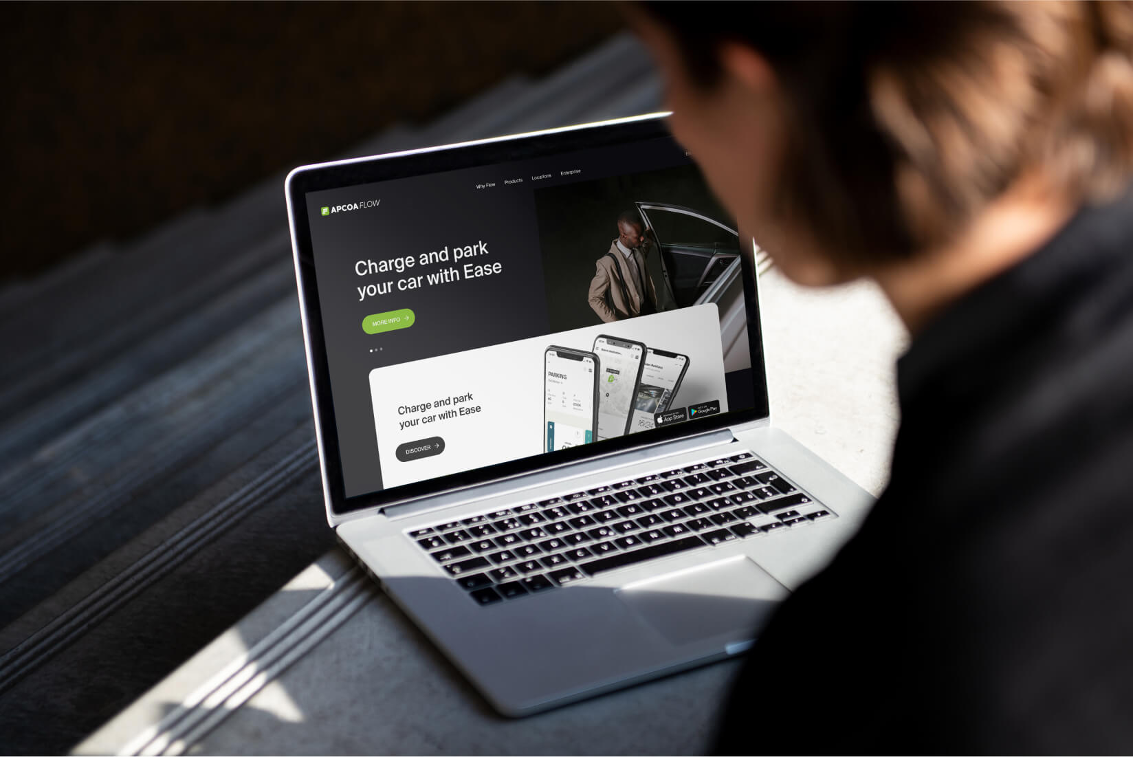
APCOA Flow
Mobility App
Credits
- Client APCOA Holdings GmbH
- Product Owner Pascal Owe
- Product Design Nicola Napoli, Manuel Astorga
- UI Design Didac Cidoncha
The urban landscape is rapidly evolving with increased numbers of vehicles and a significant shift towards electric transportation. Traditional parking solutions are failing to address the complexities of modern urban mobility, and electric vehicle owners face additional hurdles in locating convenient charging stations. Our challenge was to design a holistic solution that integrates these two needs in a user-friendly, efficient experience.
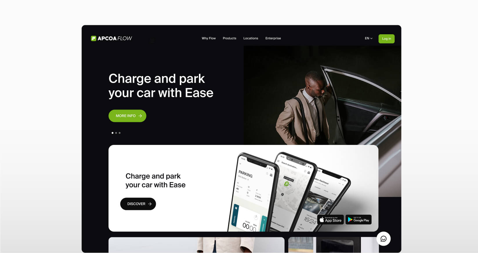
APCOA Flow is a modern app designed to fullfil two of the most important urban requirements: finding parking and charging electric vehicles (EVs). Alongside the user app, internal dashboards enable the creation and management of parking facilities included in the main product, ensuring a seamless back-end to front-end experience.
The Challenge
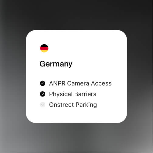
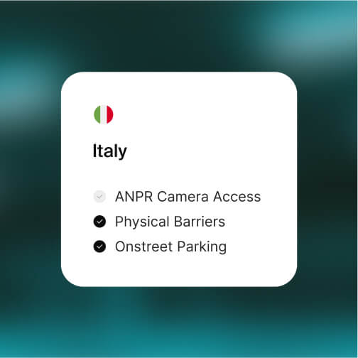
14 countries, one app
APCOA operates in 14 countries across Europe, all of them starting with a white label app and implementing it independently from each other based on the local market specific needs and available technologies. Our goal was to understand the diverse parking and charging methodologies across all markets and develop a unified, consistent design solution able to cover the needs of all countries with the minor number of adjustments.
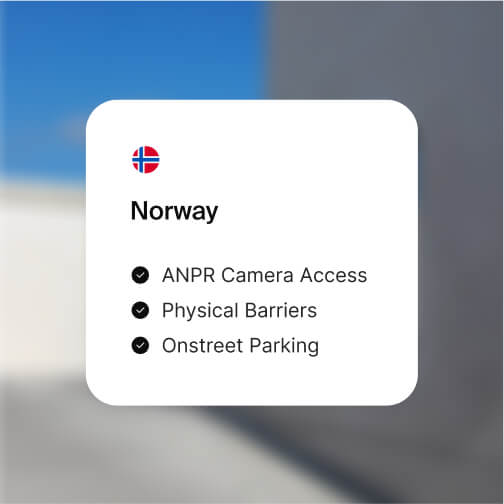
Norway stood out as the country with the most advanced among the local apps: it was the only one including a charging service, it offered the biggest number of features and was developed taking into consideration the highly-advanced technologic environment of the country.
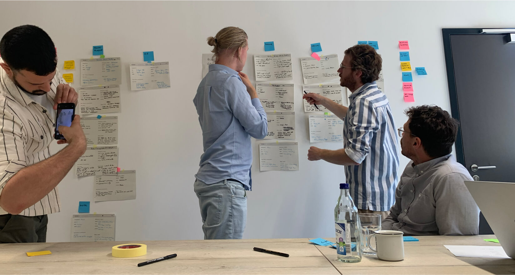
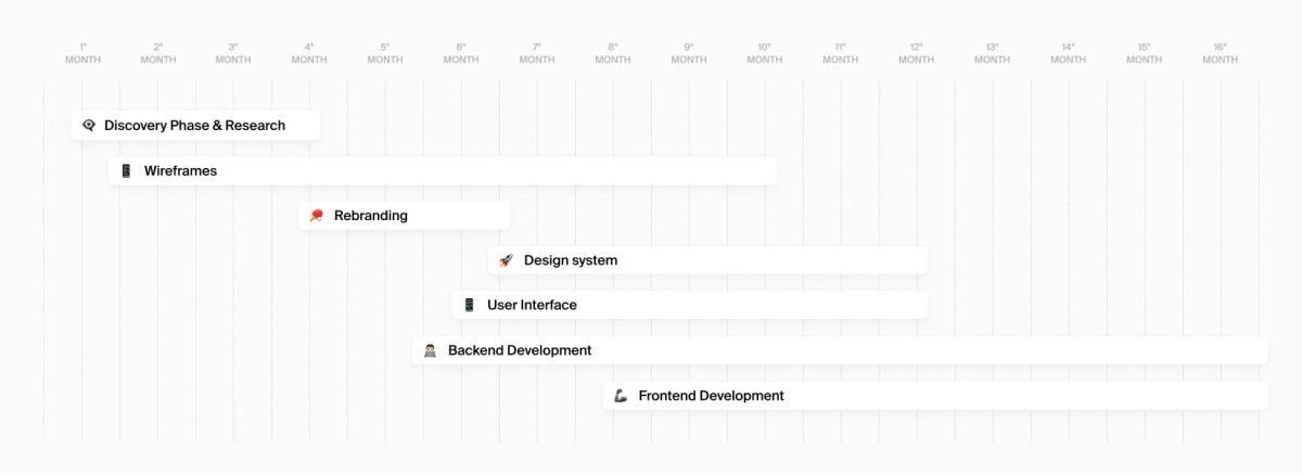
Discovery phase
A series of brand workshops and interviews were conducted during the discovery phase, gathering relevant inputs and insights from country managers, vehicle owners (both traditional & electric), parking space providers, and EV charging experts. The research phase led to the following key findings:
- Traditional vehicle owners primarily wanted quick and easy parking solutions;
- EV owners were concerned about charging point availability, compatibility, and cost comparison;
- Parking providers sought more efficient ways to monetise their spaces.
The Solution
App features
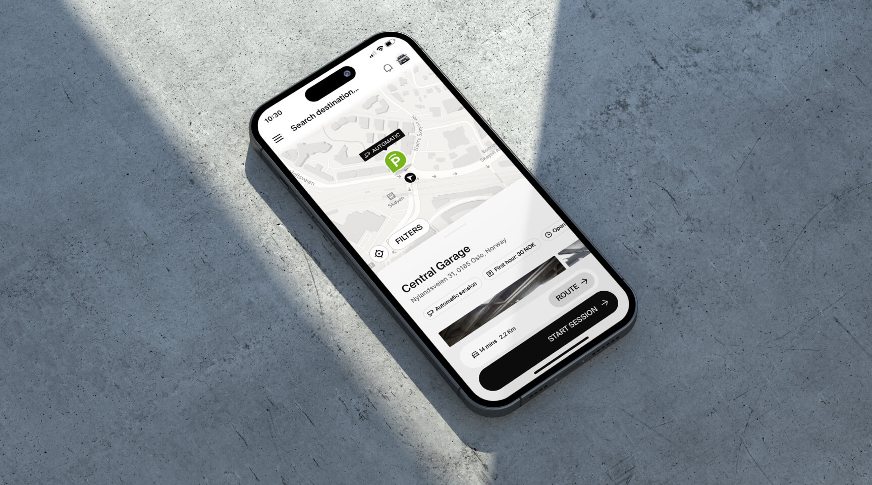
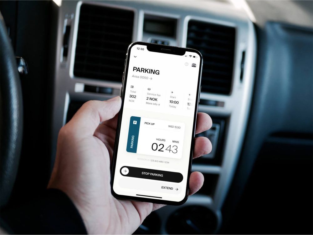
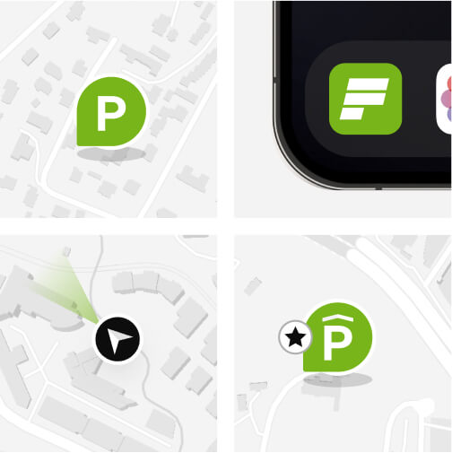
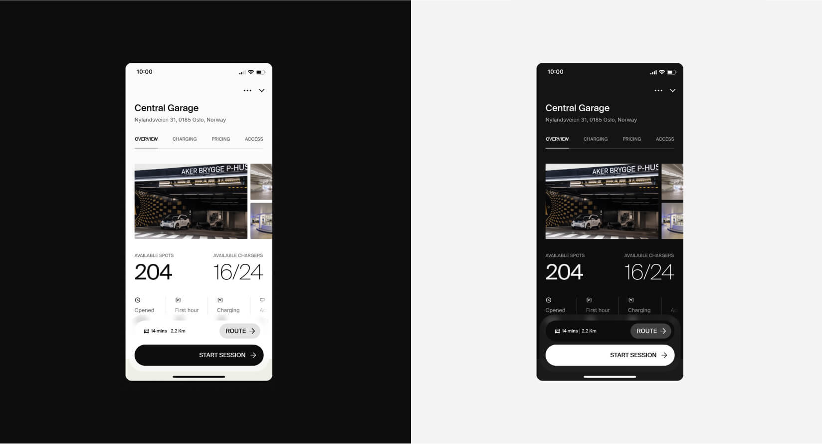
- Real-time Parking: thanks to the geolocation, users can find the nearest available parking facility operated by Apcoa (‘off-street parking’) or simply park their vehicles in the street (‘on-street parking’) based on the local city rates;
- Advanced EV Charging Filter: EV owners can start their research based on their vehicle type, plug compatibility, and charging speed requirements;
- Dynamic Pricing: In-app dynamic pricing based on demand, time of day, and special events;
- Subscription model: users can rent a parking spot on a weekly or monthly base in one or more parking facilities operated by the client;
- Benefits: The benefits are a B2B product purchased by entities such Universities, Airports and private companies to provide their users and employees with parking benefits and custom advantages;
- Cooperative app use: users belonging to the same family/entity can include multiple, co-shared vehicles in their profiles. Each car avatar can be customised according to the real appearance of the vehicle;
- Charging cards: users can register a charging card, top it up and pay automatically when starting a charging session.
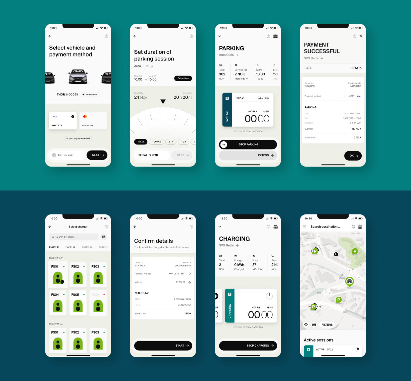
Prototype A
‘On-street Parking’ Flow
Prototype B
‘Charging’ Flow
Brand Refreshment
In parallel to the discover phase, we stablished the new brand route that would guide the app look and feel and be the foundation of the new design system. The new design guidelines needed to reflect our modern solutions, a sense of versatility and adaptability, yet preserving the most recognisable elements of the existing brand.
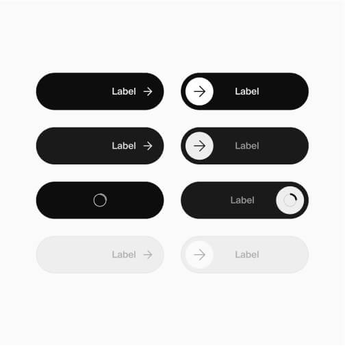
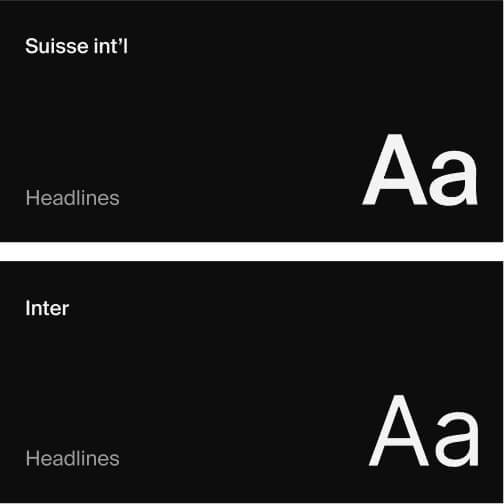
We adopted a modern, clean, and readable typeface to improve legibility across devices and to give a fresh, contemporary feel.
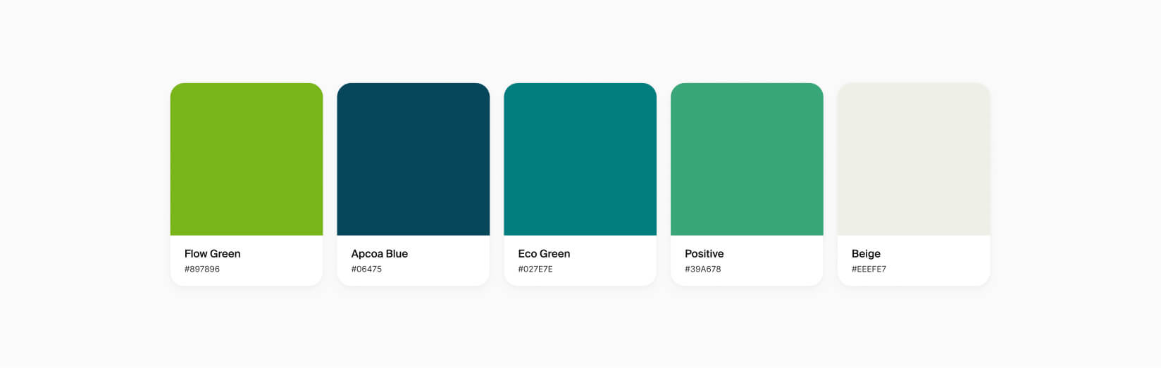
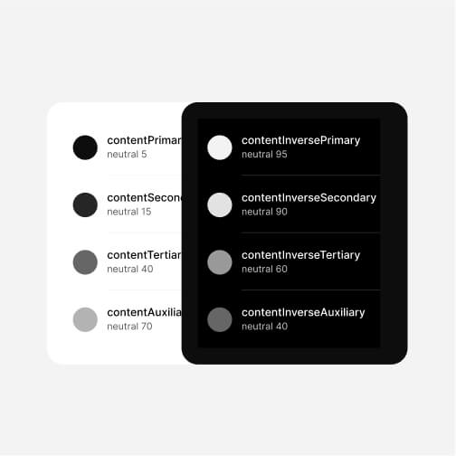
Starting from the two existing palette of APCOA, we implemented the brand palette adding new colours to enhance the UI look and feel. We introduced some neutral tones of grey and a beige, allowing a better visual hierarchy and a more diversified design strategy. These neutral shades provide a sense of balance, making the user interface less strenuous on the eyes and more aesthetically pleasing.
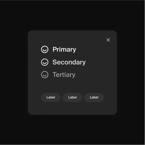
Dark Mode
Each atom of the design system was built both for dark and light mode, resulting with two perfectly equal variations of the app look.
Conclusions
In the evolving urban mobility space, APCOA Flow stands as a testament to the power of user-focused design, bridging the gap between traditional parking requirements and the emerging needs of electric vehicle owners.